1/2
Android’s New Look: Sleek or Soulless?
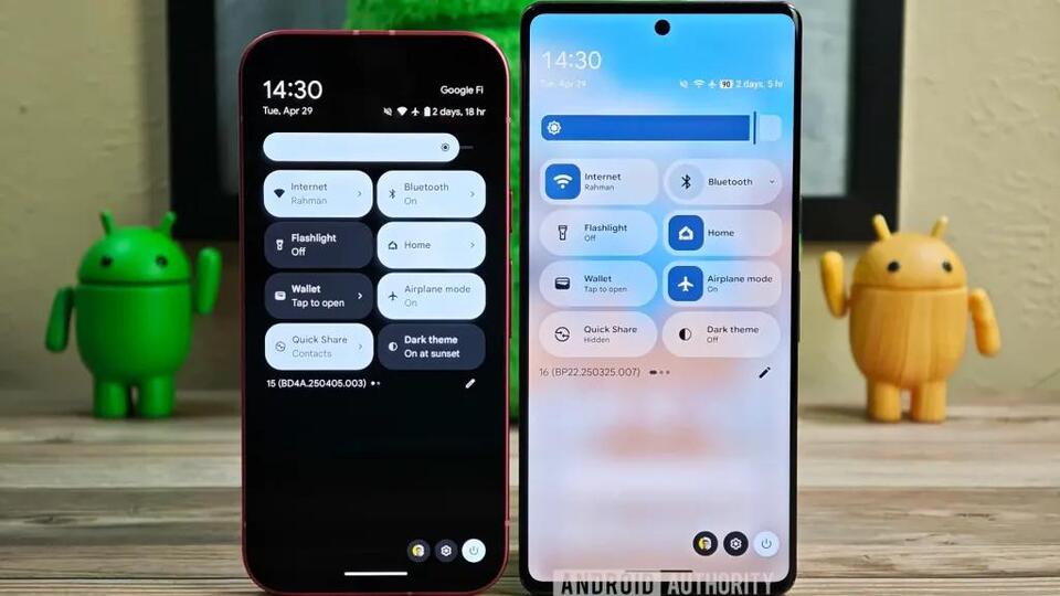
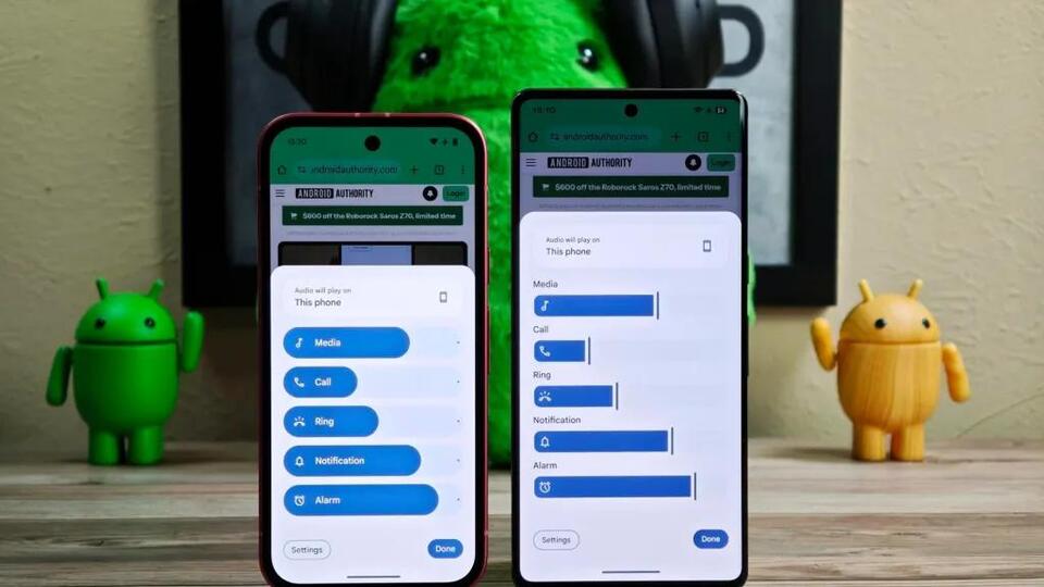
Android 16 is hiding a bold redesign—think thinner, sharper, and way less bloated. The notification shelf and volume slider are finally getting a diet, and the lock screen will shift colors to match your vibe. But will this sleeker style make Android feel more modern, or strip away its character? Would you trade playful design for a cleaner, more efficient interface? Let’s debate: is this the refresh Android needs, or a step too far? #Android16 #UIDesign #TechDebate #MobileInnovation #Tech
2025-05-04
write a comment...