1/1
Would You Want the Apple Logo Back?
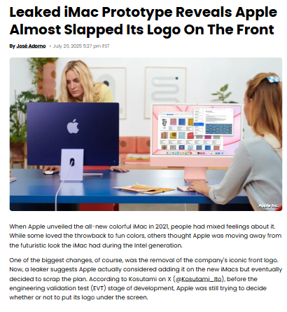
So, Apple almost put its iconic logo right under the new iMac’s screen—then scrapped the idea. As a longtime Mac user, I’m torn: the clean, logo-free front feels modern, but there’s something classic about that badge. Does minimalism win, or should Apple embrace its branding roots? Would a front logo change your perception of the iMac’s design? Let’s debate! #Tech #AppleDesign #iMac
2025-07-31
write a comment...