1/1
Is Apple’s Liquid Glass UI a Win or a Fail?
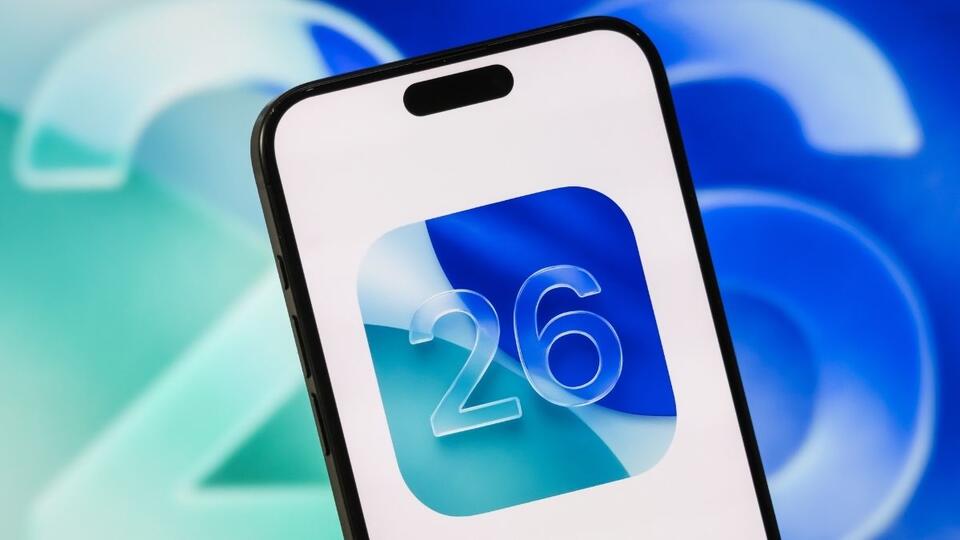
Apple’s Liquid Glass interface in iOS 26 was bold, but let’s be real—readability took a hit. With iOS 26.2, Apple claims to have balanced style and function, giving us skeuomorphic icons and a lockscreen clock you can actually read. But is this enough to win back frustrated users, or is Apple just putting a glossy bandage on deeper design issues? Would you stick with the new look or go classic? #Tech #Apple #iOS26
2026-01-17
write a comment...