1/1
Roku’s New Subscriptions Tab: Game Changer or Clutter?
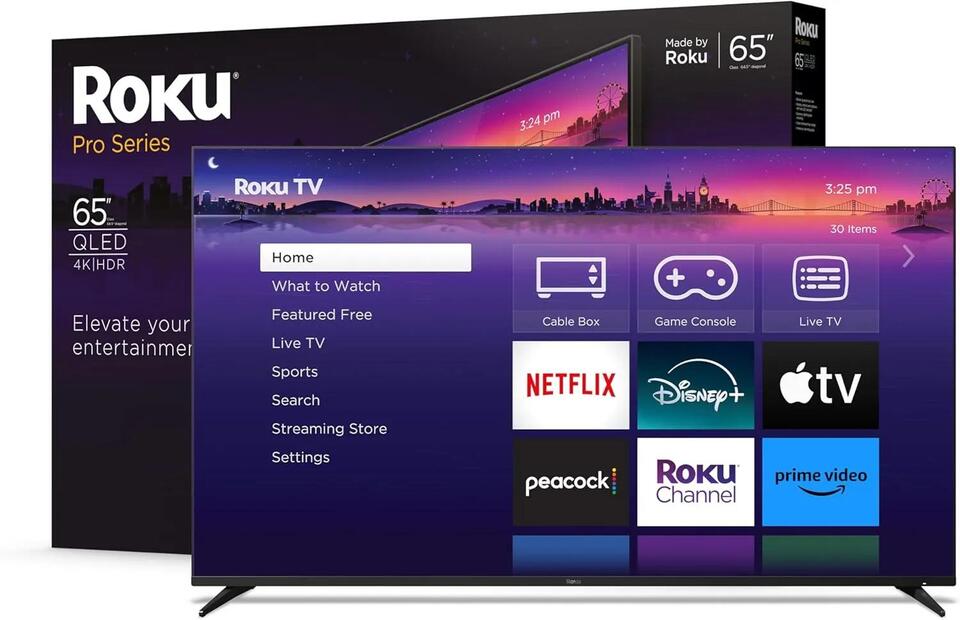
Roku just rolled out a new subscriptions tab on its home screen, automatically gathering all your premium streaming services in one spot. Some users love the streamlined access, while others worry it’s a step toward a crowded interface. Is this a smart UI move that keeps Roku ahead of Google, Apple, and Amazon, or the start of feature bloat? What’s your take on balancing convenience with a clean user experience? #Tech #Roku #StreamingWars
2026-01-29
write a comment...